Comes out of Lockdown with a new look.
From the information architecture to the design concept to the programming of the website. The new visual appearance of the Neuss Art Museum was created within a few months. The new website sets the tone in terms of color and form. Posters and other printed matter followed.
Clear the stage for the
Exhibitions
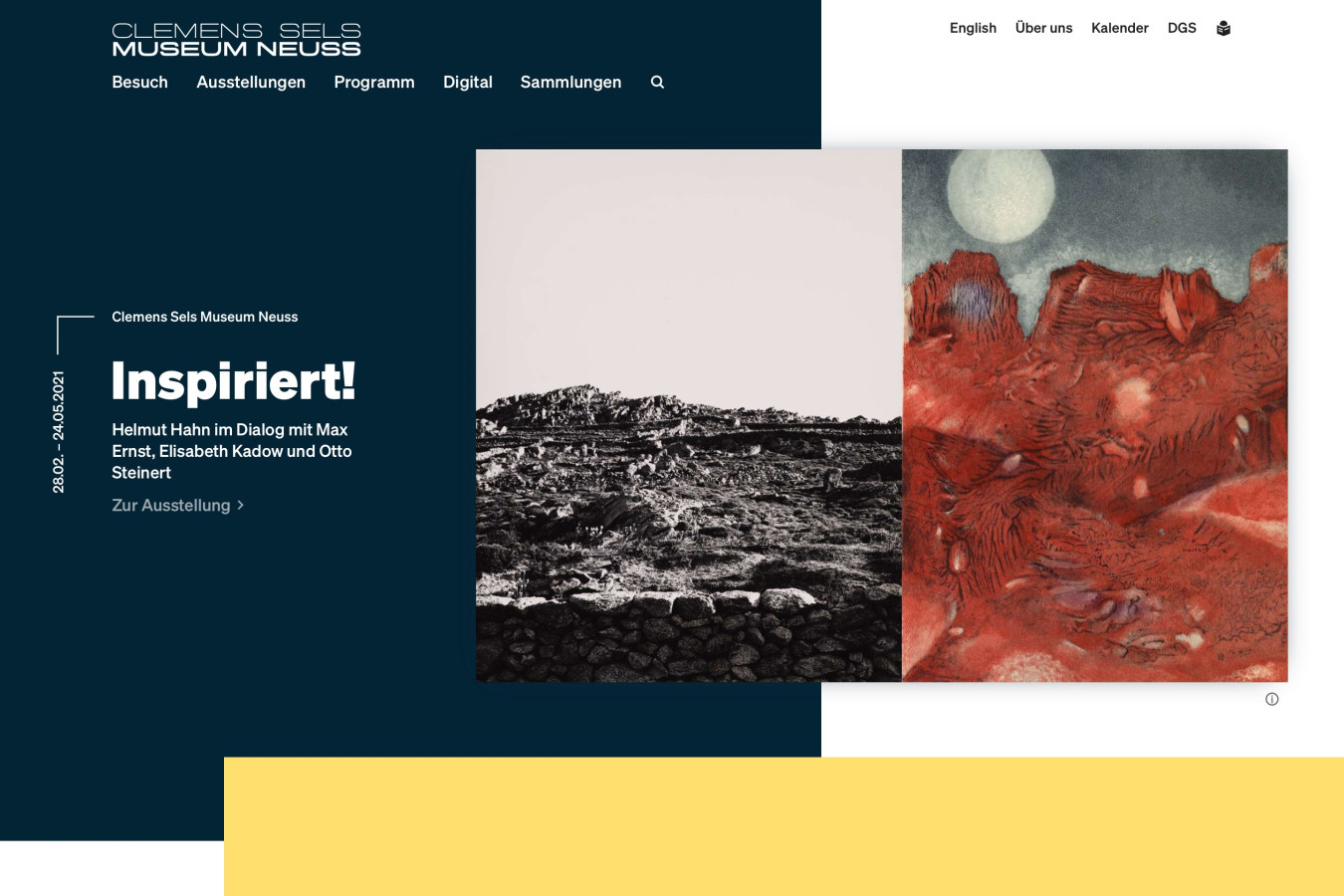
Each exhibition has its own color. The website takes on the color of the current exhibition and thus always comes alive.
Digital collection
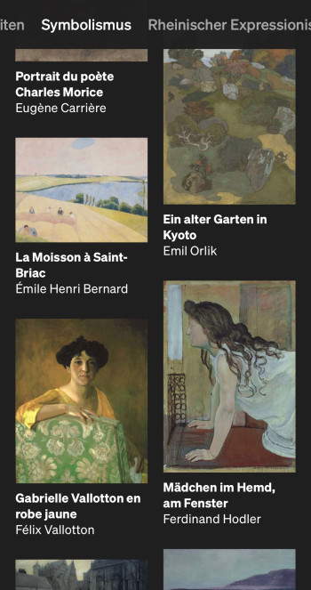
The Art and Cultural History Collection makes a big splash on the new website - on small and large screens.

Art Education
The museum offers an extensive educational program. Scheduled offers can be accessed via a calendar. The website additionally offers a large overview page of all offers. A comprehensive booking system allows visitors to register for an event in three simple steps from home or via smartphone.
Typography


Söhne by Klim Type Foundry characterizes the new look of the museum. The font is very clear and does not push itself into the foreground - this is reserved for art. Nevertheless, it has enough independence to give the museum its own identity.
Poster series from parcel34

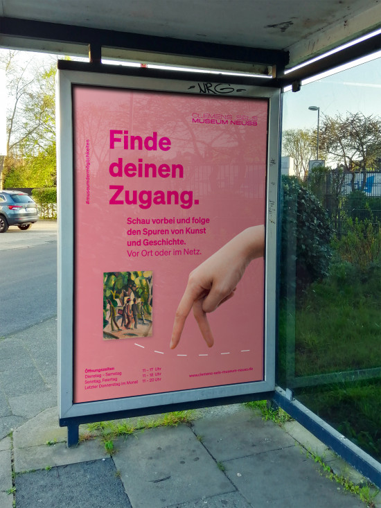
An analog and digital poster series was used to draw attention to the reopening after the Corona lockdown and to the digital offerings of the new website.
The website's color and design language was reworked and supplemented with new elements.
More about the poster series on parzelle34.de.
Resonance

It's incredibly valuable when someone can think both.
We are particularly pleased with the many positive responses we have received from all sides. The museum team can finally present the exhibitions and their rich educational offerings in a variety of ways.
Visitors get a good impression of what to expect before they even enter the museum and can find the right event even faster.
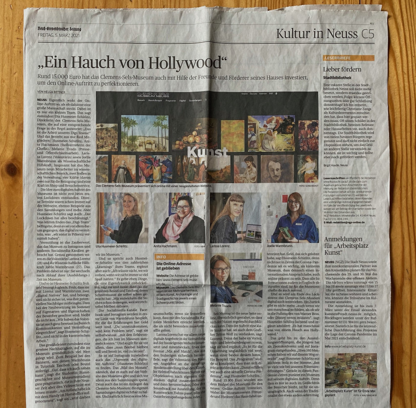
And the press is also delighted.
(Article of the Rheinische Post)